UX Design
Website Design & Development
National Children’s Museum — playful, accessible redesign powered by a scalable design system
Responsibilities
Product Design, UX Design, Design System, Accessibility, Developer Handoff
Stack
Figma, Sanity,
Timeline
4 months
Overview
The National Children’s Museum wanted its website to feel as joyful and welcoming as the physical museum. However, visitors struggled to find practical information, explore exhibits and move toward purchasing tickets.
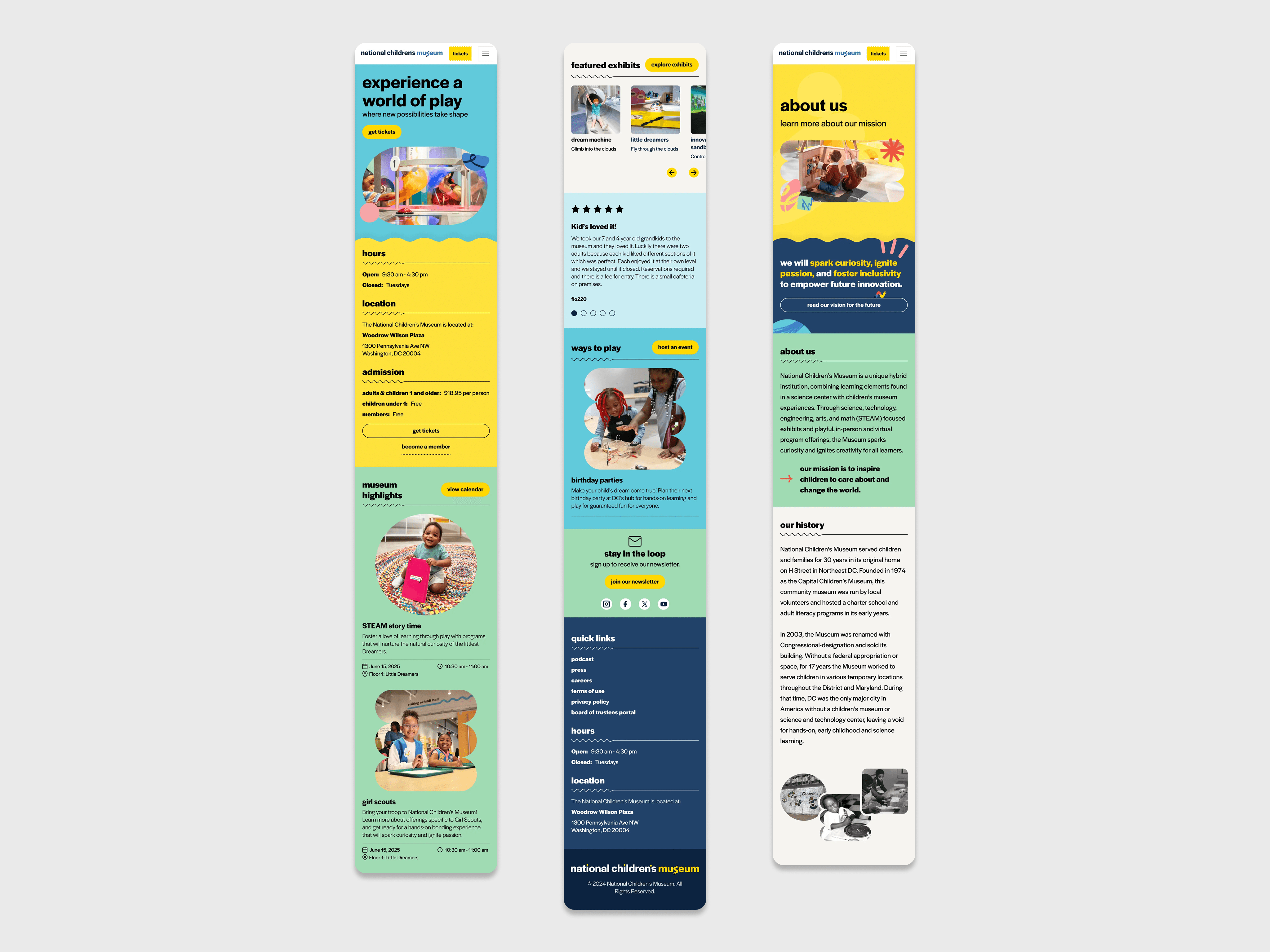
This was particularly important because more than 90% of visitors accessed the website on mobile. The redesign therefore needed to do more than modernise the visual identity, it needed to rethink the experience around the context in which most visitors were using it.
As UX Designer, I led the experience design from early structure and wireframes through high-fidelity design, system creation and developer collaboration.
Role: UX Designer
Timeline: Four months
Team: Strategy, design, development and museum stakeholders
Focus: Mobile UX, accessibility and design systems
Platform: Figma and Sanity
Status: Launched
Project highlights
90% mobile audience: Designed the experience around the devices used by most museum visitors.
Visitor-first navigation: Prioritised tickets, opening hours, location, exhibits and events.
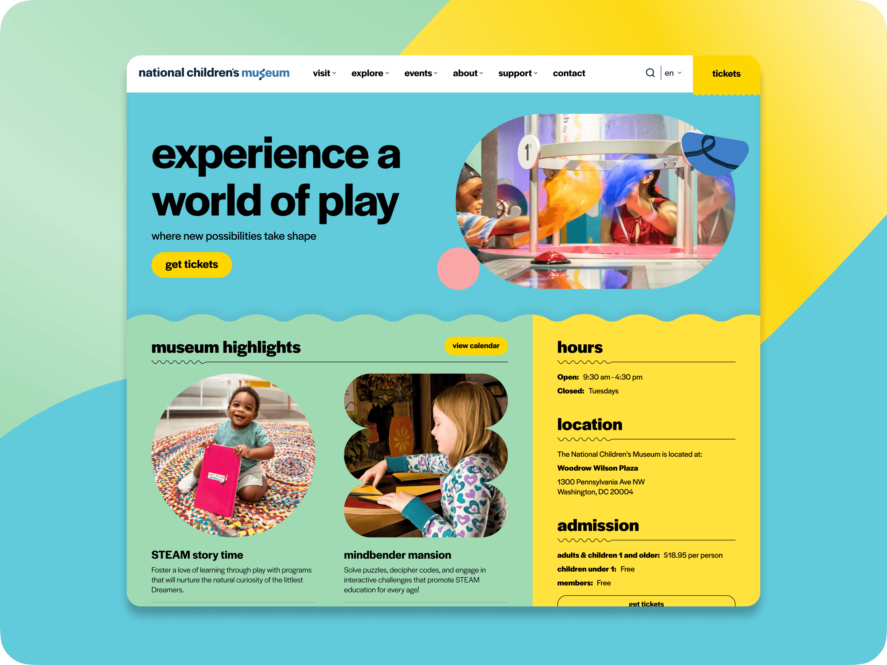
Accessible brand expression: Translated the museum’s playful identity into a readable and inclusive interface.
Modular design system: Created reusable components and design tokens for future pages and content.
The challenge
The original website had become difficult for both visitors and the museum team to use. Important information was distributed across the experience, interface patterns were inconsistent and the mobile journey did not reflect the needs of the majority of users.
The underlying website was also difficult to maintain. Multiple plugins and layers of custom CSS had accumulated over time, making seemingly simple updates increasingly complicated.
The redesign needed to solve several connected problems:
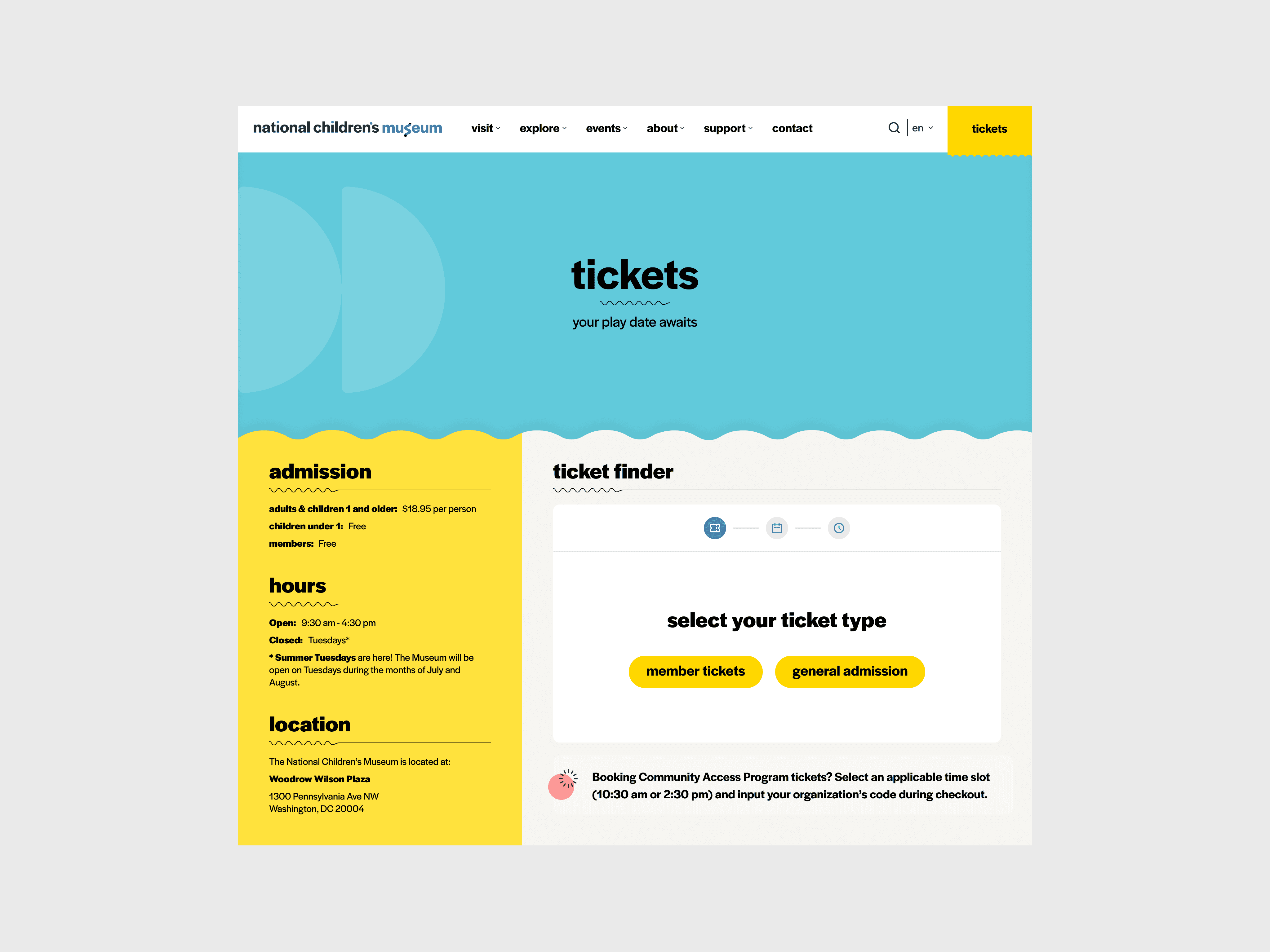
Essential information was difficult to locate. Visitors needed quicker access to tickets, opening hours, location and current exhibits.
The mobile journey was not prioritised. The experience had not been designed around its largest audience.
Accessibility was inconsistent. Typography, colour, navigation and interaction patterns needed a more systematic approach.
The brand felt disconnected. The website did not capture the energy and playfulness of the museum.
The system was difficult to maintain. The internal team needed reusable patterns that could support future content.
My role
I was responsible for translating the museum’s visitor and organisational needs into a clear digital experience.
My work covered both the structure of the website and the system used to deliver it:
Defined the information architecture and priority visitor journeys.
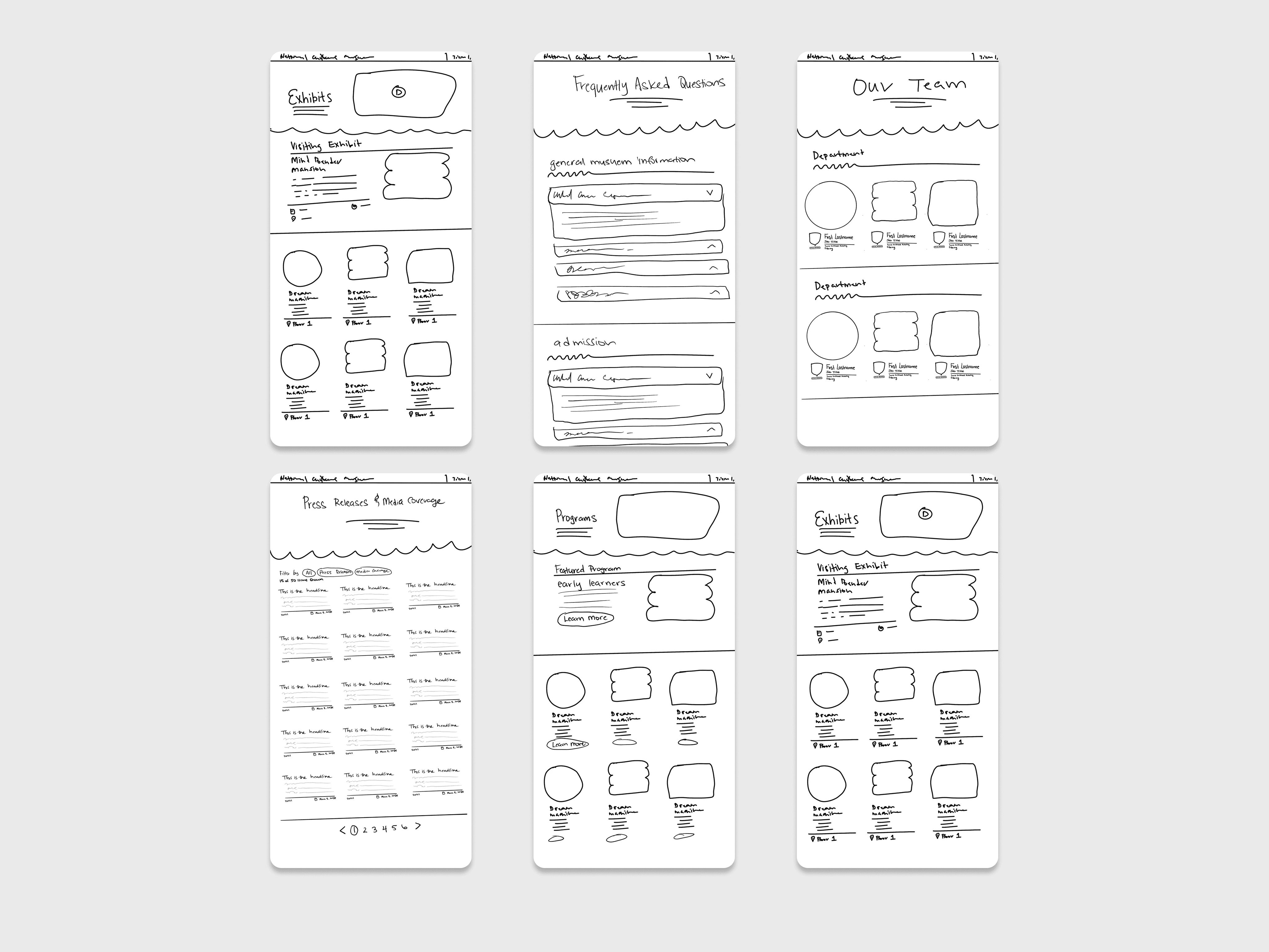
Created mobile-first wireframes for the most important pages.
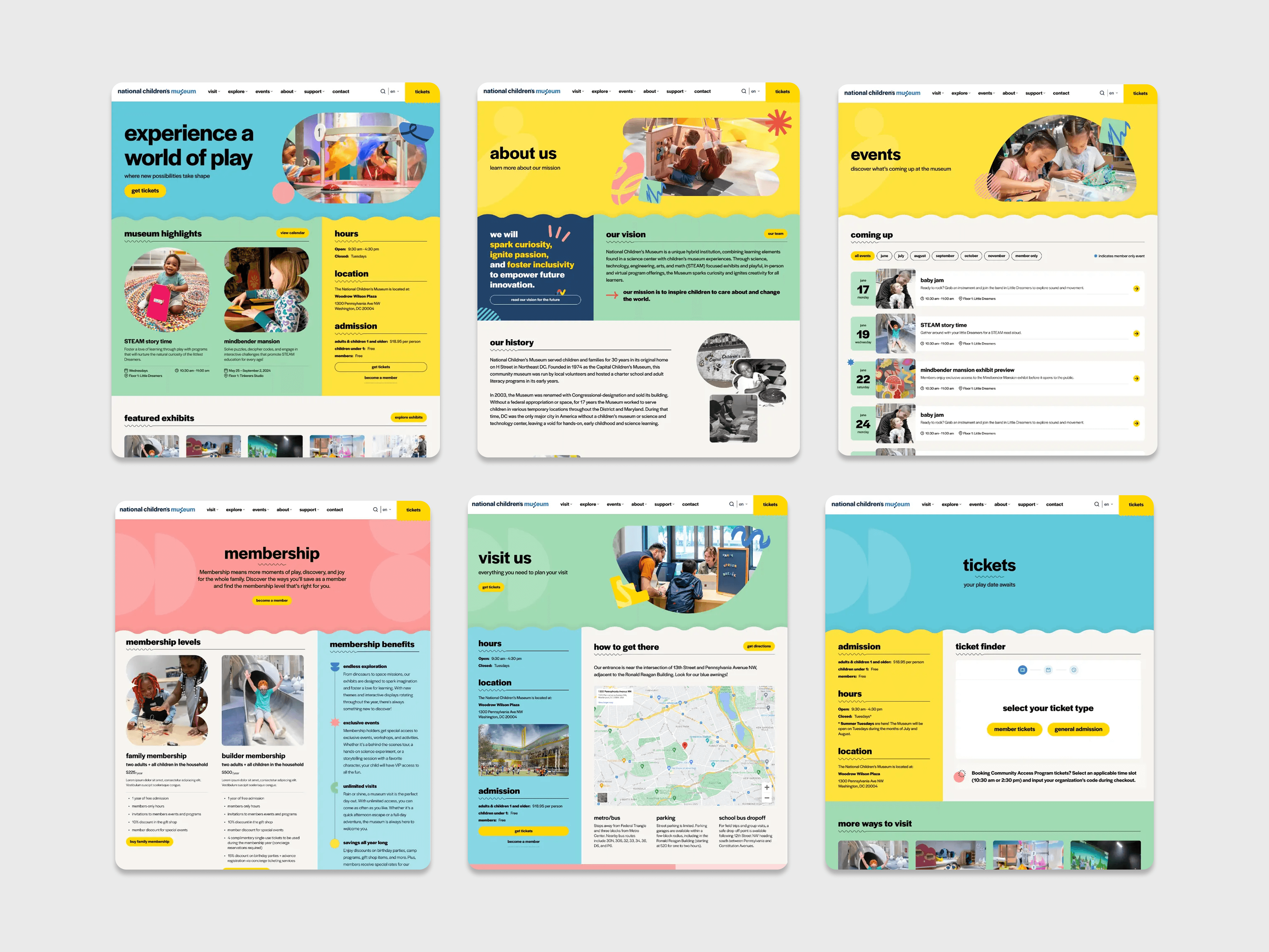
Designed responsive layouts and interaction patterns.
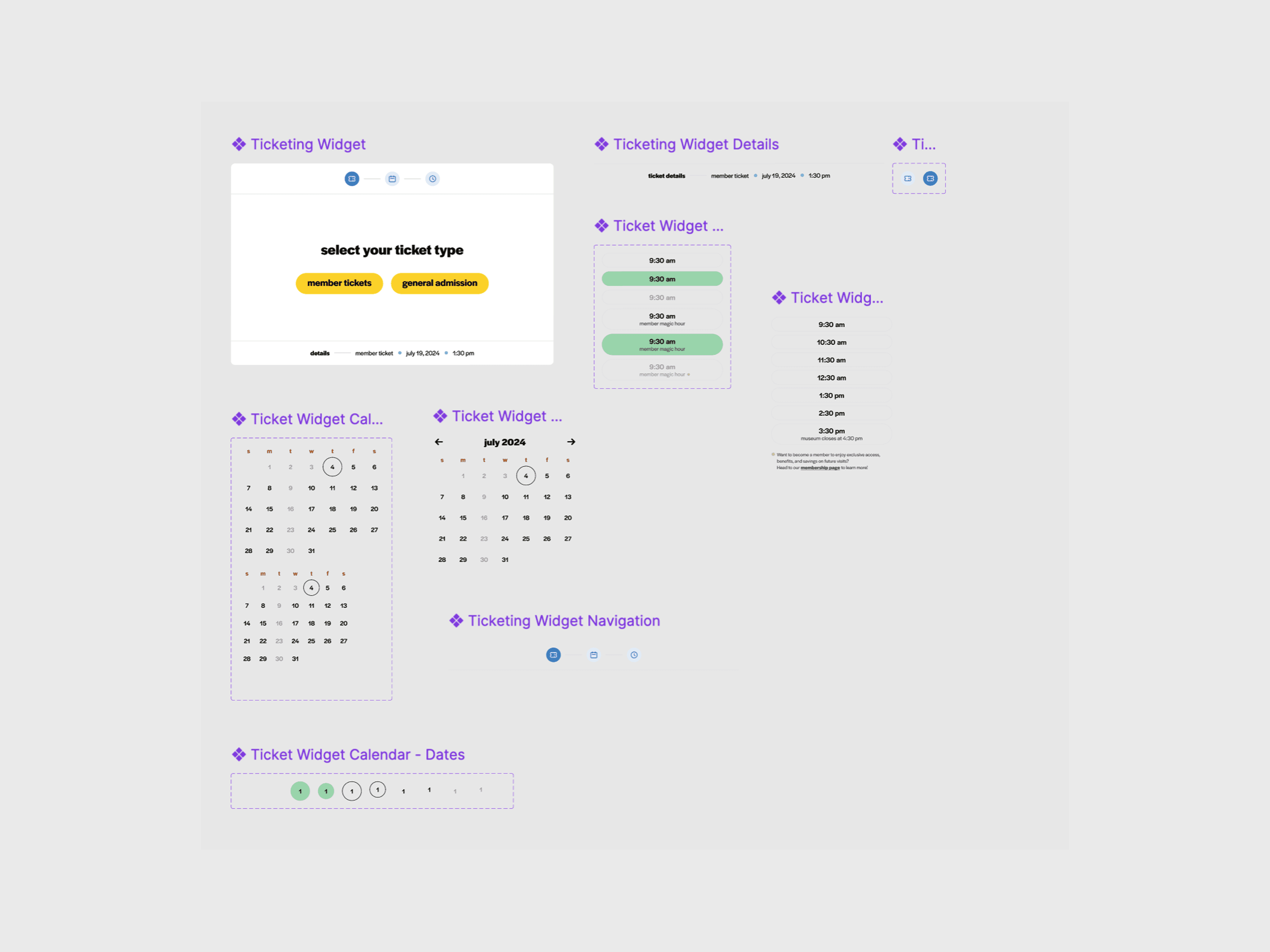
Built reusable components for recurring content needs.
Applied accessibility principles to typography, colour and interaction.
Collaborated with developers throughout implementation.
Used design tokens and Dev Mode to improve handoff consistency.
I worked within a cross-functional team. Strategy and content direction were developed collaboratively, while I led the UX structure, responsive interface and component-system work.
Process
Start with visitor intent
The first step was identifying the questions visitors were most likely to have when planning a museum visit:
What can my family experience?
When is the museum open?
Where is it located?
What events are happening?
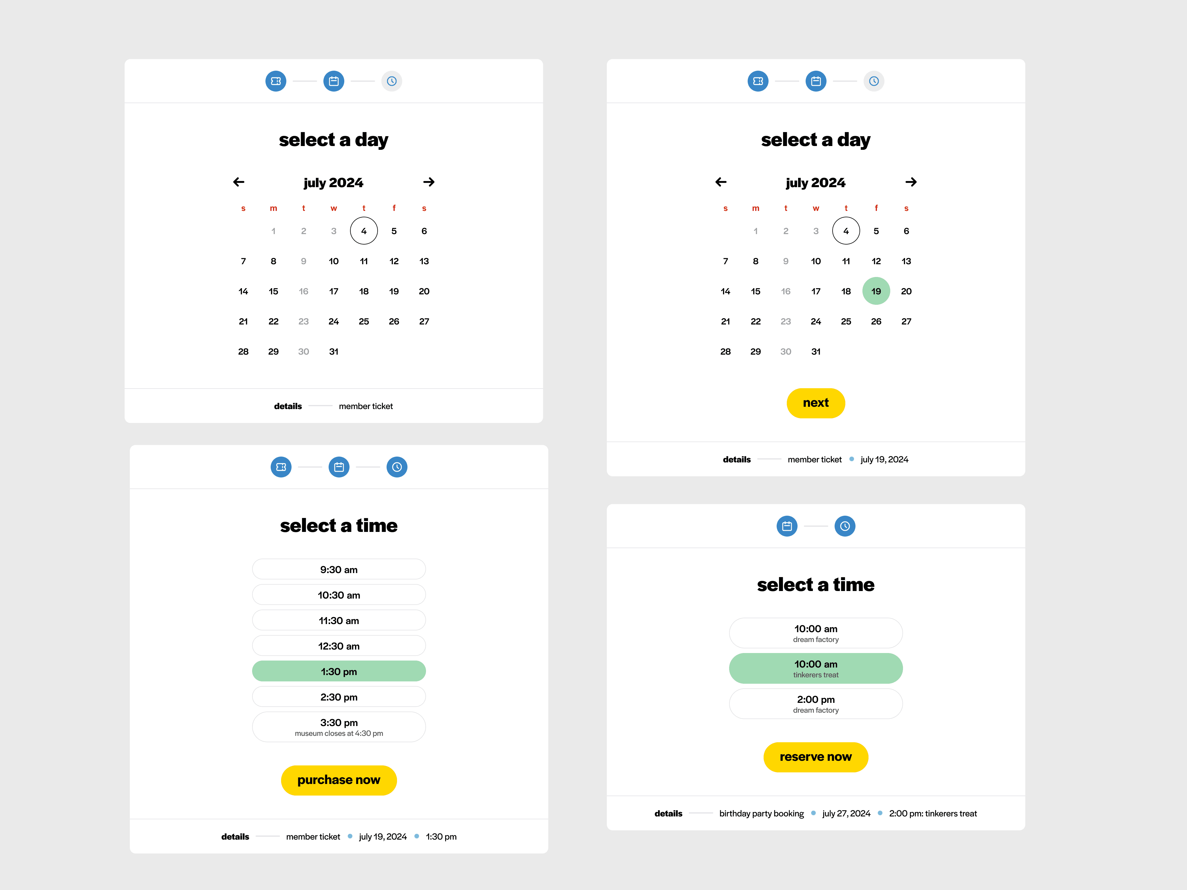
How do I purchase tickets?
These needs informed the navigation, homepage hierarchy and content structure. Instead of expecting visitors to understand the museum’s internal organisation, the experience was structured around the information required to plan a visit.
Design around the mobile context
With more than 90% of traffic coming from mobile devices, mobile could not be treated as a reduced version of the desktop website.
The smallest breakpoint was used to establish:
Content priority
Navigation behaviour
Ticket visibility
Touch interactions
Typography and spacing
Image behaviour
Page performance considerations
The experience was then expanded for larger screens without changing the fundamental hierarchy.
Balance playfulness with accessibility
The museum needed an expressive visual experience, but playfulness could not come at the expense of clarity.
The design system established consistent relationships between:
Expressive typography and readable body content
Bright brand colours and sufficient contrast
Organic visual elements and predictable interface patterns
Flexible content layouts and consistent spacing
Playful interactions and accessible behaviour
This allowed the website to feel distinctive without making visitors relearn how each section worked.
Build for future content
Reusable components were designed around recurring content needs instead of individual pages.
The system included patterns for:
Visitor information
Exhibits and events
Editorial content
Calls to action
Images and media
Navigation and wayfinding
Responsive content sections
Working with developers during implementation helped ensure the Figma system reflected how the website would actually be built and maintained.
Outcome
The project delivered a responsive website designed around the needs of the museum’s predominantly mobile audience.
The redesigned experience:
Created clearer paths to tickets, exhibits, events and visitor information.
Established consistent navigation across mobile and desktop.
Translated the museum’s identity into a more expressive digital experience.
Introduced reusable components for future pages and content.
Improved design-to-development alignment through shared tokens and documented patterns.
Created a more maintainable foundation for the museum’s internal team.
The project reinforced an important principle: a playful experience still needs a predictable foundation. The stronger the underlying structure, the more expressive the visual design can be without becoming confusing.
Where available, add verified post-launch evidence such as ticket-click performance, navigation engagement, accessibility testing or stakeholder feedback.
Key design decisions
Design mobile first. With more than 90% of visitors using mobile devices, the smallest breakpoint determined the content hierarchy and navigation—not the desktop layout.
Prioritise visit-planning information. Tickets, opening hours, location and events were placed prominently because they answered visitors’ most immediate questions.
Create reusable content patterns. Components were designed around recurring museum needs, allowing new pages to be created without introducing inconsistent layouts.
Reflection
This project showed me that playful design works best when supported by a clear and predictable structure. With more time, I would validate the redesigned ticket journey through post-launch usability testing and analytics.